Design Systems
My Experience Top
Since 2014, I've worked on design systems for companies big and small, and in various capacities. Some brands you know. Some you may not.


I've worn many hats over the years, including design lead, interface engineer, and technical writer. I like to work end-to-end. I enjoy partnering across disciplines to define the visual language and strategic direction of a system. Other core strengths include designing and engineering tokens, components, patterns, guidelines, and tooling.
AI Automation Top
While at Microsoft, I designed Autopilot, a Figma plugin powered by Microsoft’s AI assistant, Copilot. Autopilot enables designers to quickly access the resources they need—without ever leaving Figma.
To use it, simply launch the plugin, select a frame, and click to receive automated suggestions for design tokens and components. Unsure how to use a component or looking for pattern guidance? Just prompt Copilot using the built-in chat input, and relevant insights appear directly within the plugin.
No context switching. No extra browser tabs. No endless scrolling through documentation or component libraries.
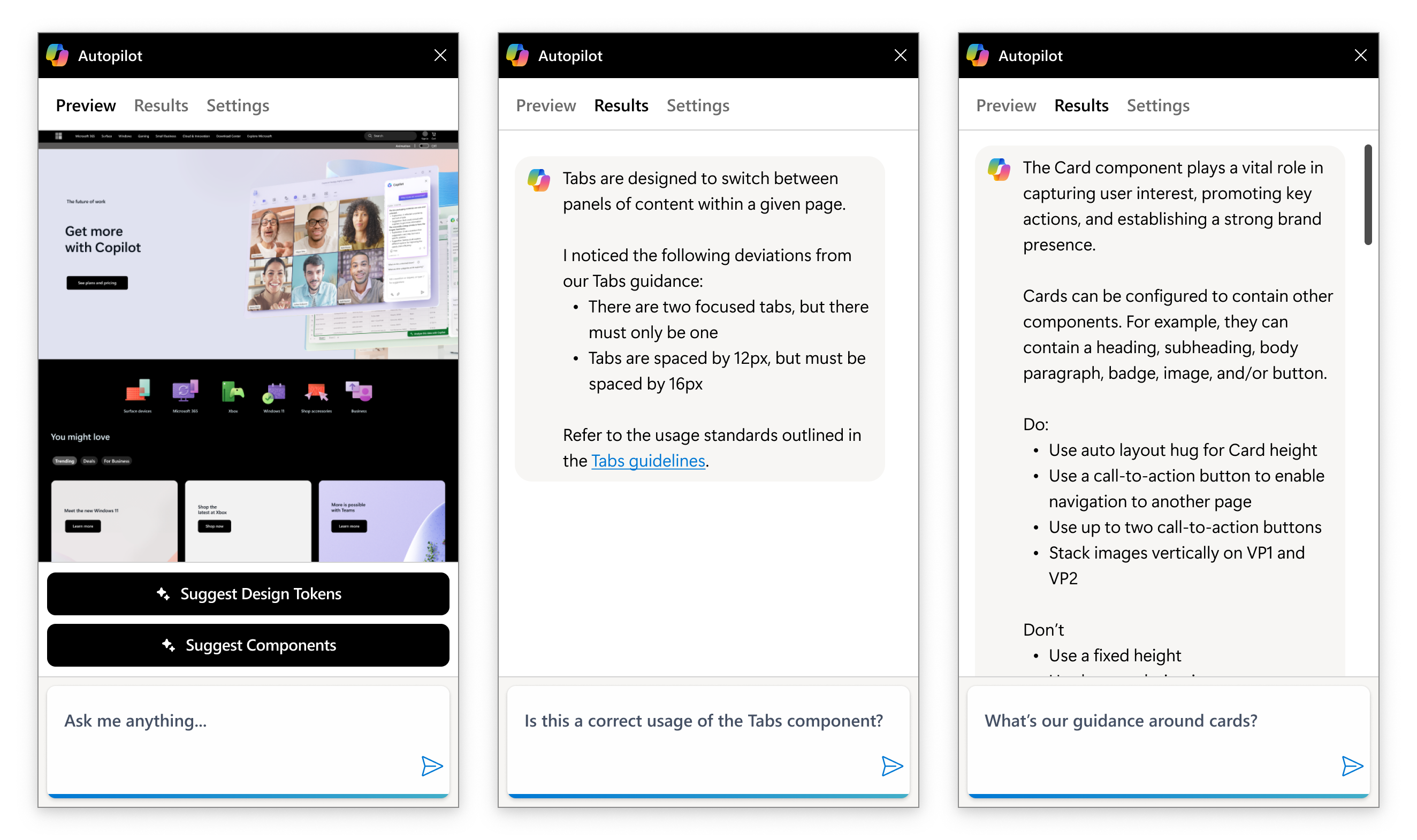
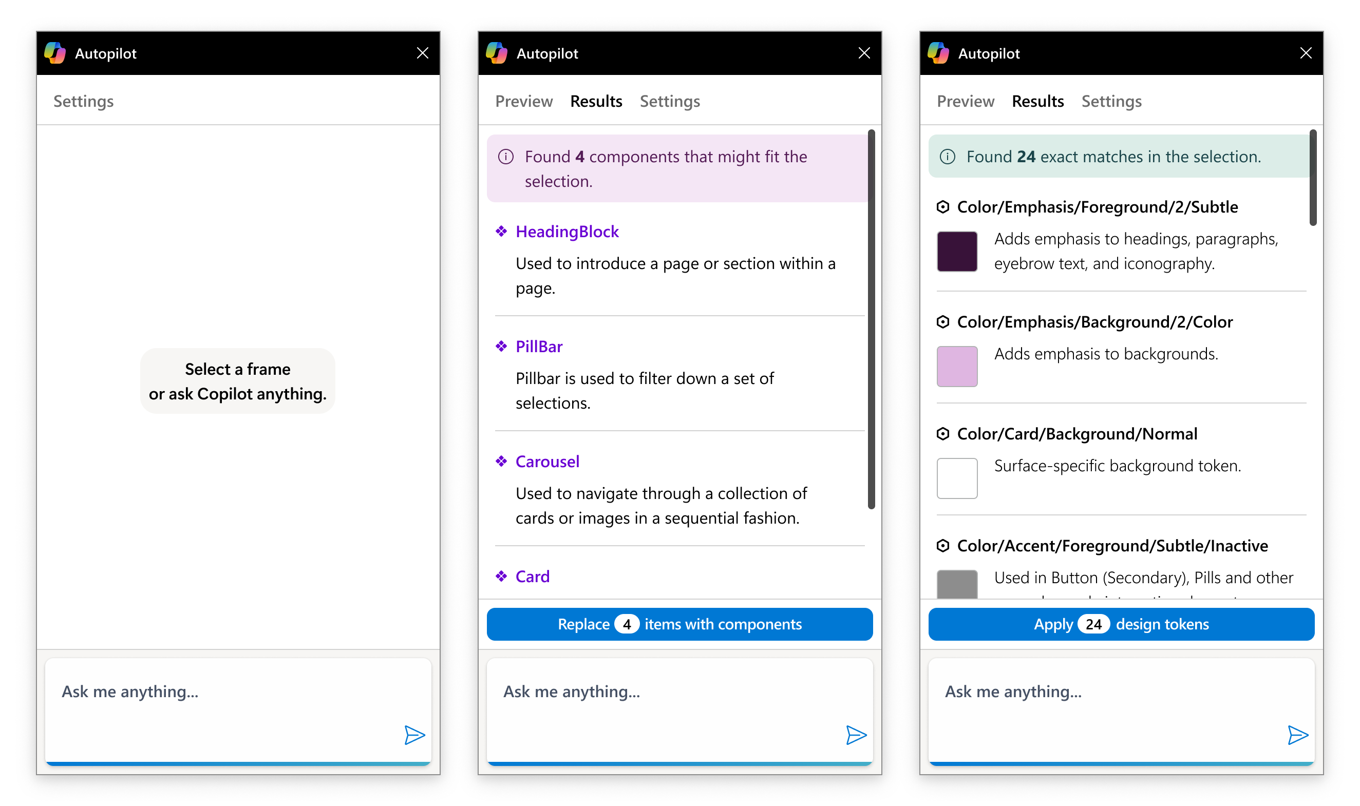
Autopilot shortcuts the Figma assets panel by allowing designers to include design tokens and components directly from the plugin UI. This means that designers can go from zero-to-full adoption with a few keystrokes and the push of a button.
Foundations Top
Principles Top
For the Apollo Design System, I applied established design principles to guide decision-making across core systems. I included these principles at the beginning of each document to help consumers understand the rationale behind key choices. This approach was especially effective in more opinionated documents, such as our motion guidelines.
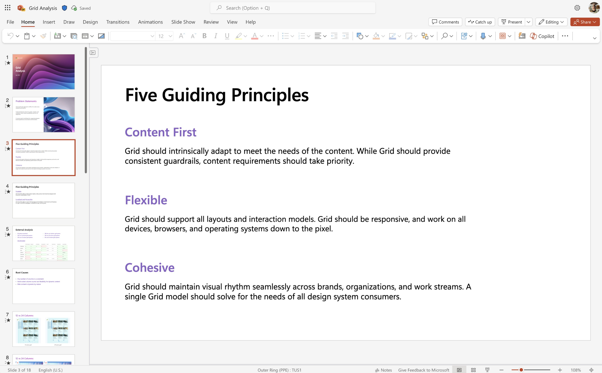
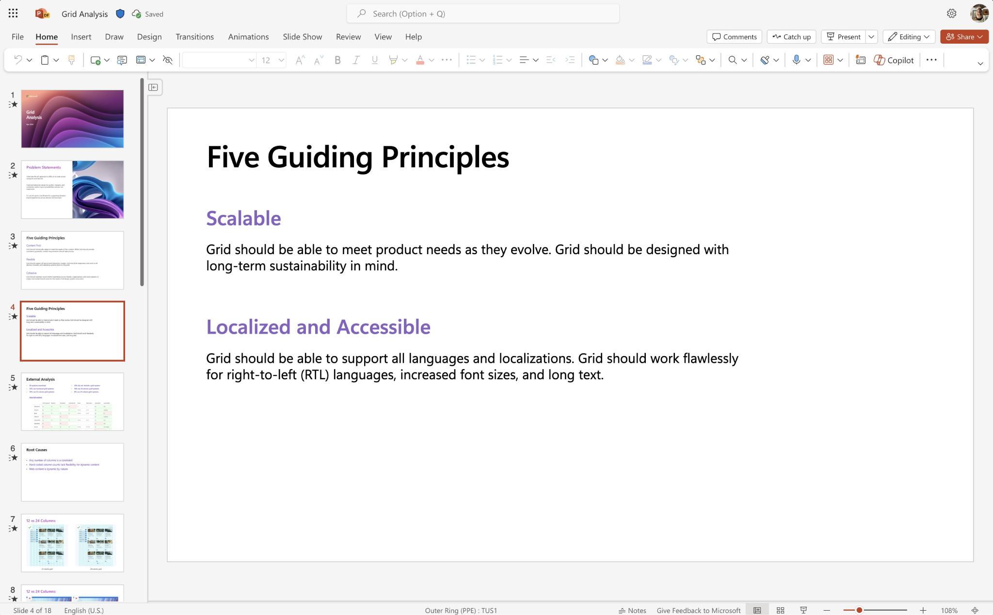
At Microsoft, I took this a step further by developing design principles to guide my early exploration of foundational elements, including the system's tooling strategy and grid model. These principles helped me stay focused on the system's needs and its key stakeholders while evaluating the best approach. They also served as a clear explanation of the rationale behind my decisions.
Processes Top
For Apollo, I collaborated with product managers and engineering leads across five distinct product workstreams to workshop models for system contribution and governance. The team prioritized flexibility and sought ways to enable contributions from across the organization. At the same time, they needed a consistent approach to system governance. I addressed this by defining models for auditing components and maintaining a product inventory over time.
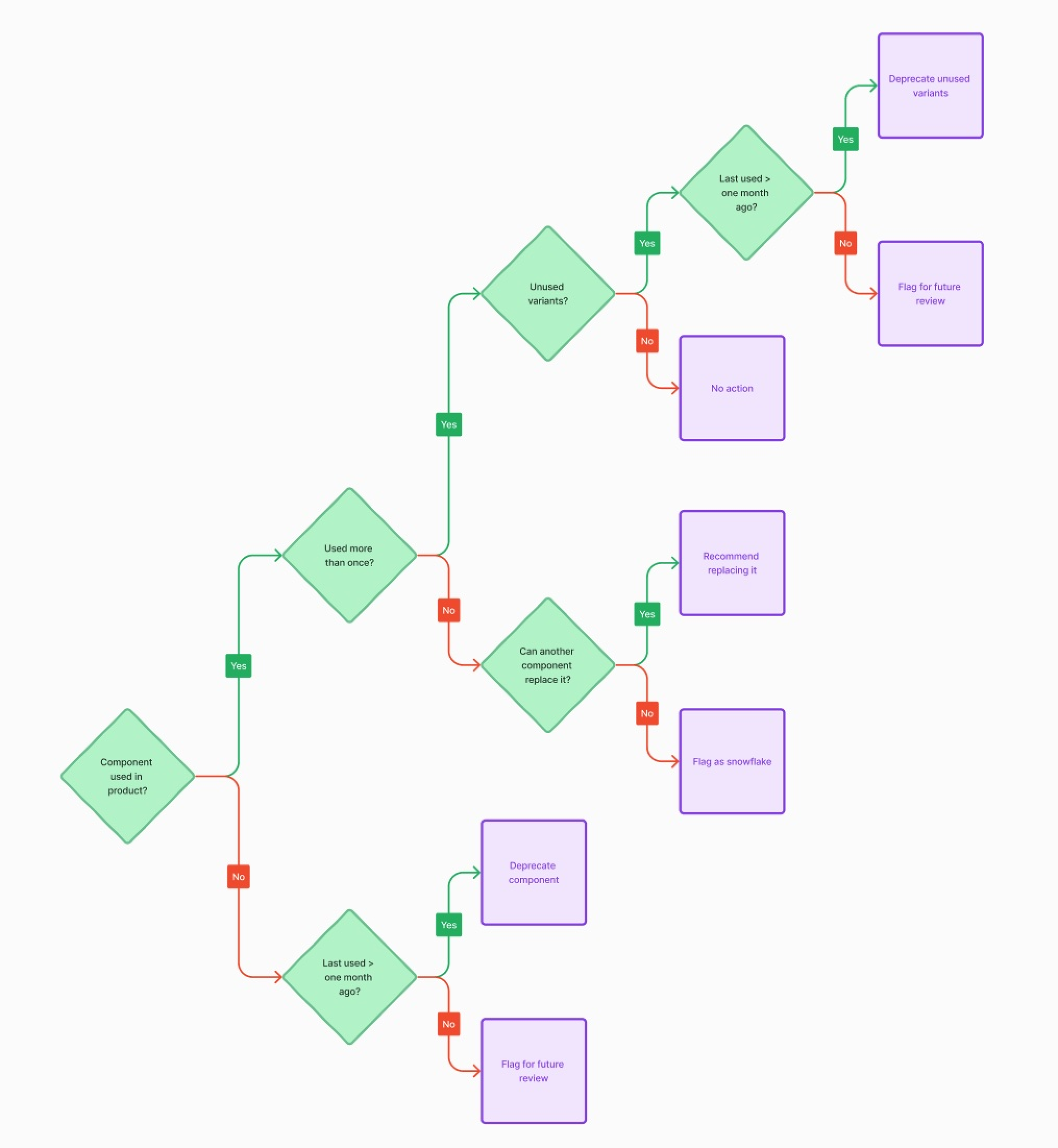
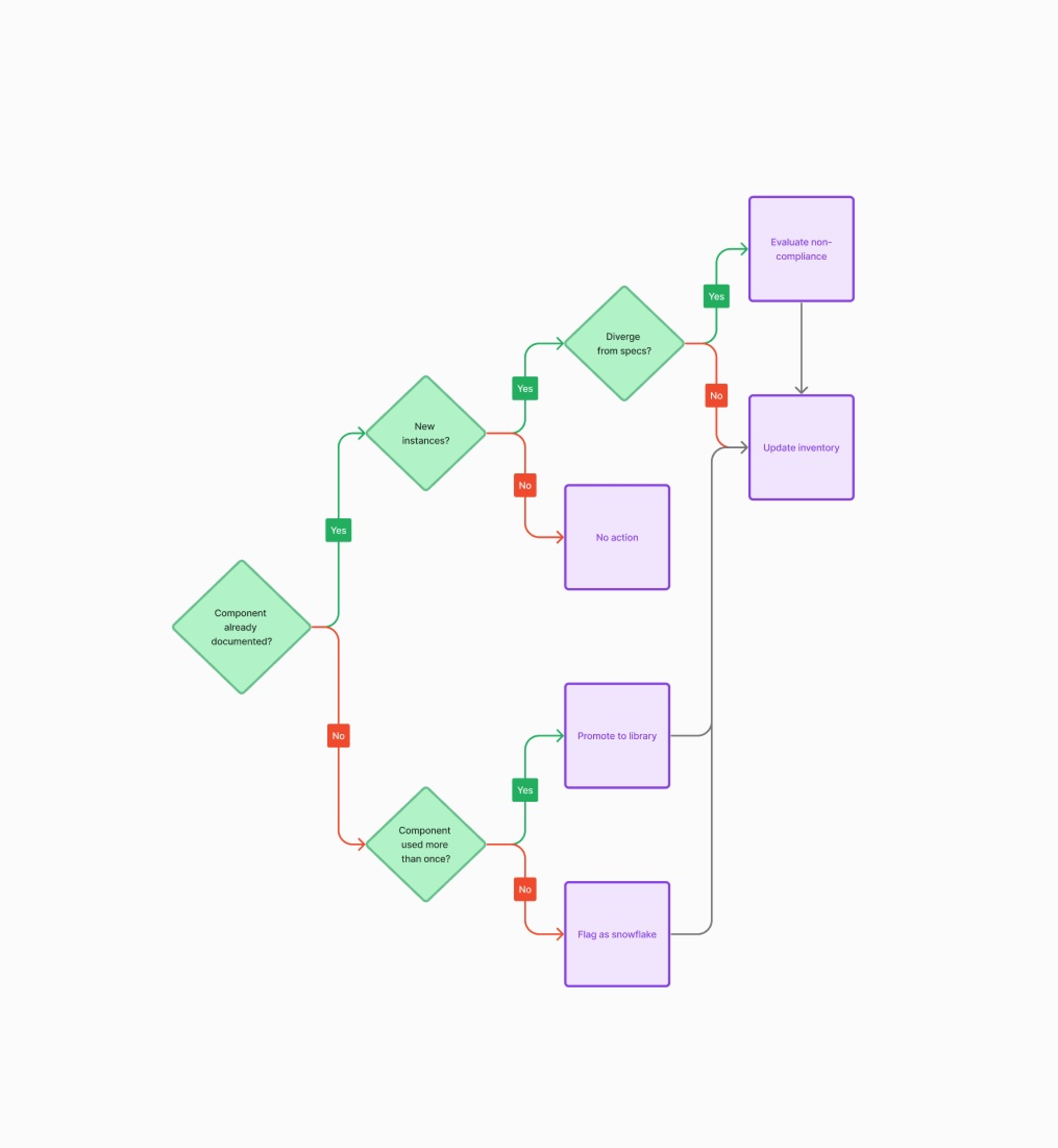
Over my year and a half as design lead for the system, I conducted multiple audits that resulted in a 13% reduction in component count and complexity. This simplification led to a leaner, more performant component library—reducing bugs, lowering maintenance overhead, and driving greater adoption across teams.
Practices Top
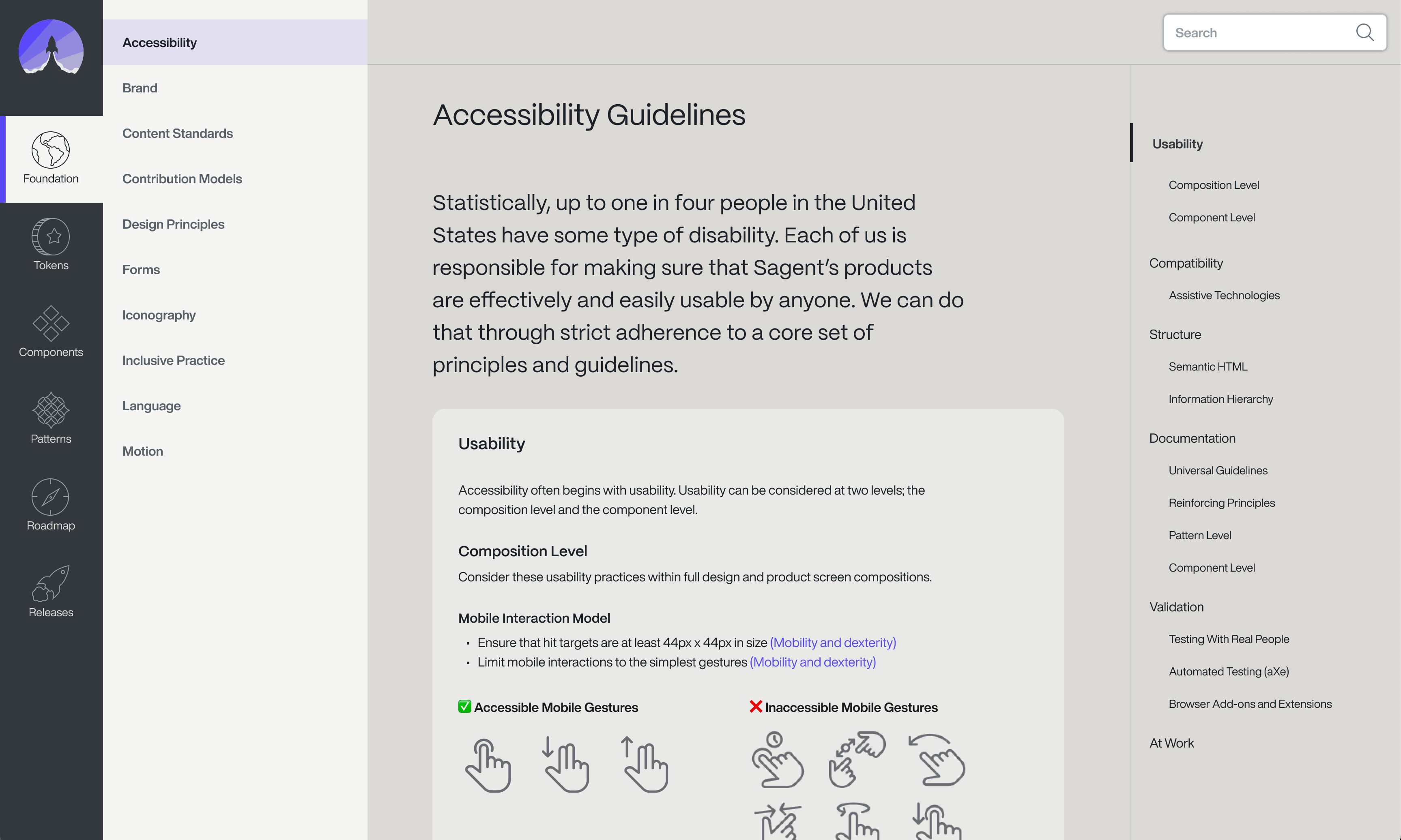
At Microsoft, I had the opportunity to collaborate closely with dedicated accessibility designers and engineers on every component I delivered. Their partnership ensured alignment with our accessibility standards—an invaluable practice that deeply shaped my approach. I've applied many of the lessons I learned to this portfolio site and continue to prioritize accessibility in all of my work.
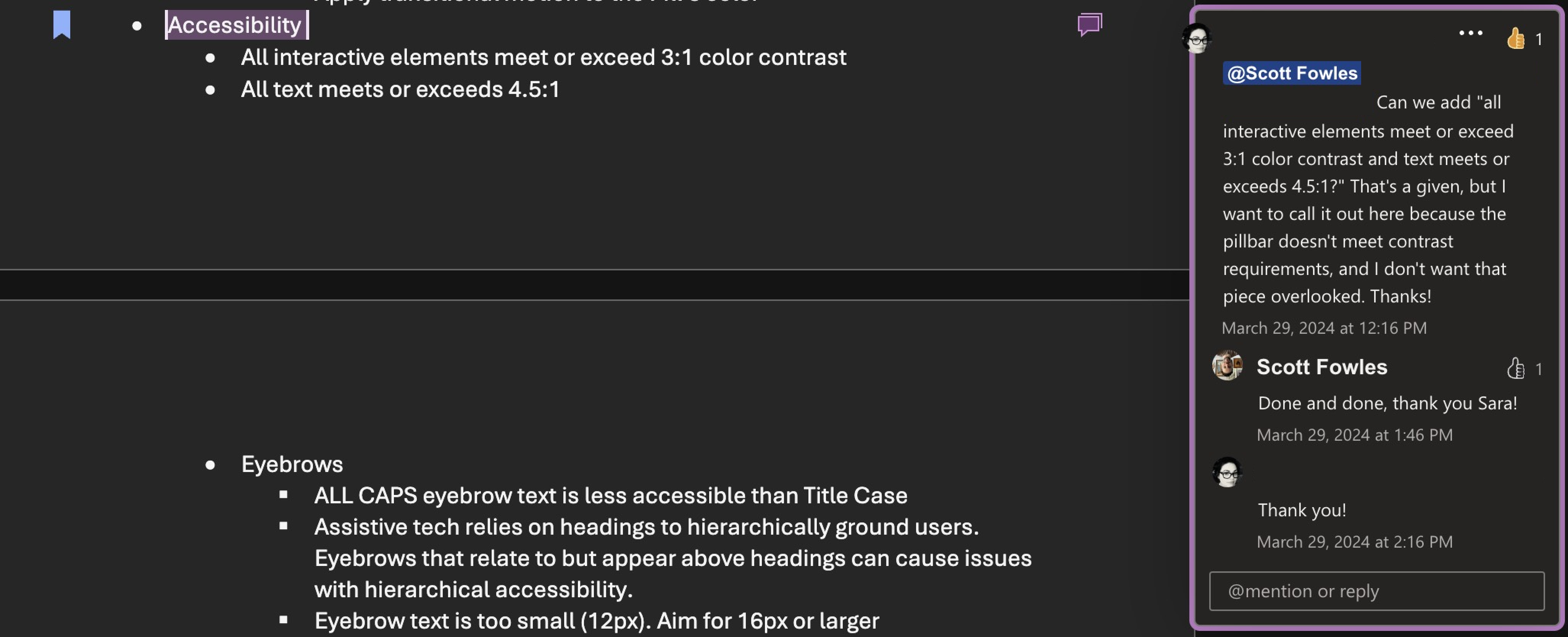
But accessibility isn't just about end users. It also applies to the people building the product. For Apollo, I established practices to ensure the system was accessible to our colleagues as well, and I documented these in our accessibility guidelines. By doing so, we created a system that more team members could contribute to over time, without being excluded.
User Interface Elements Top
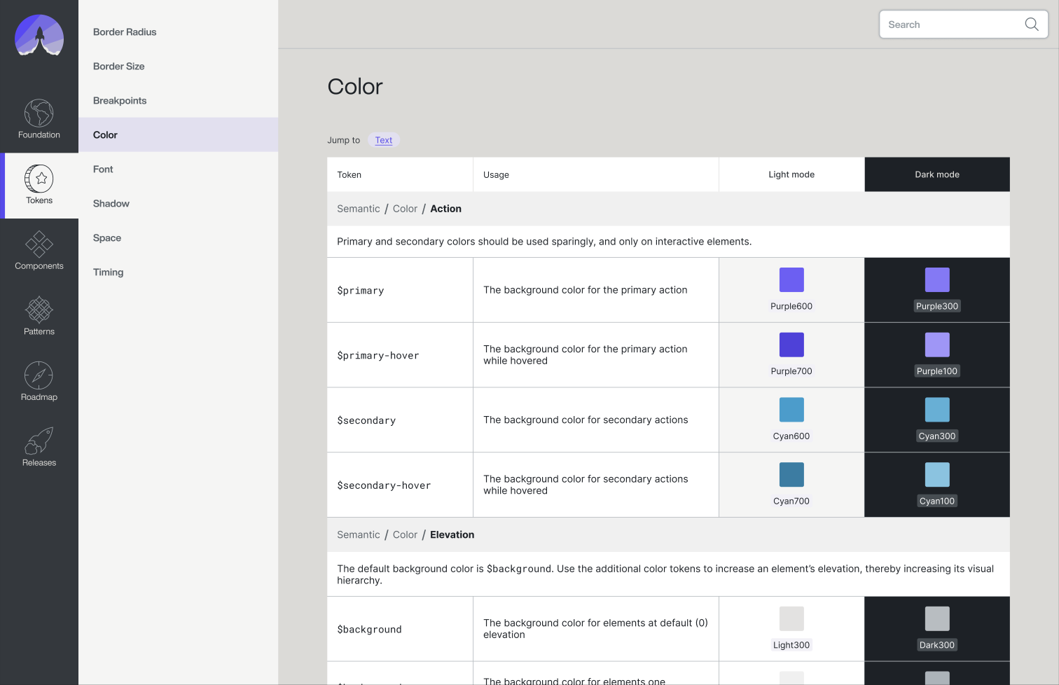
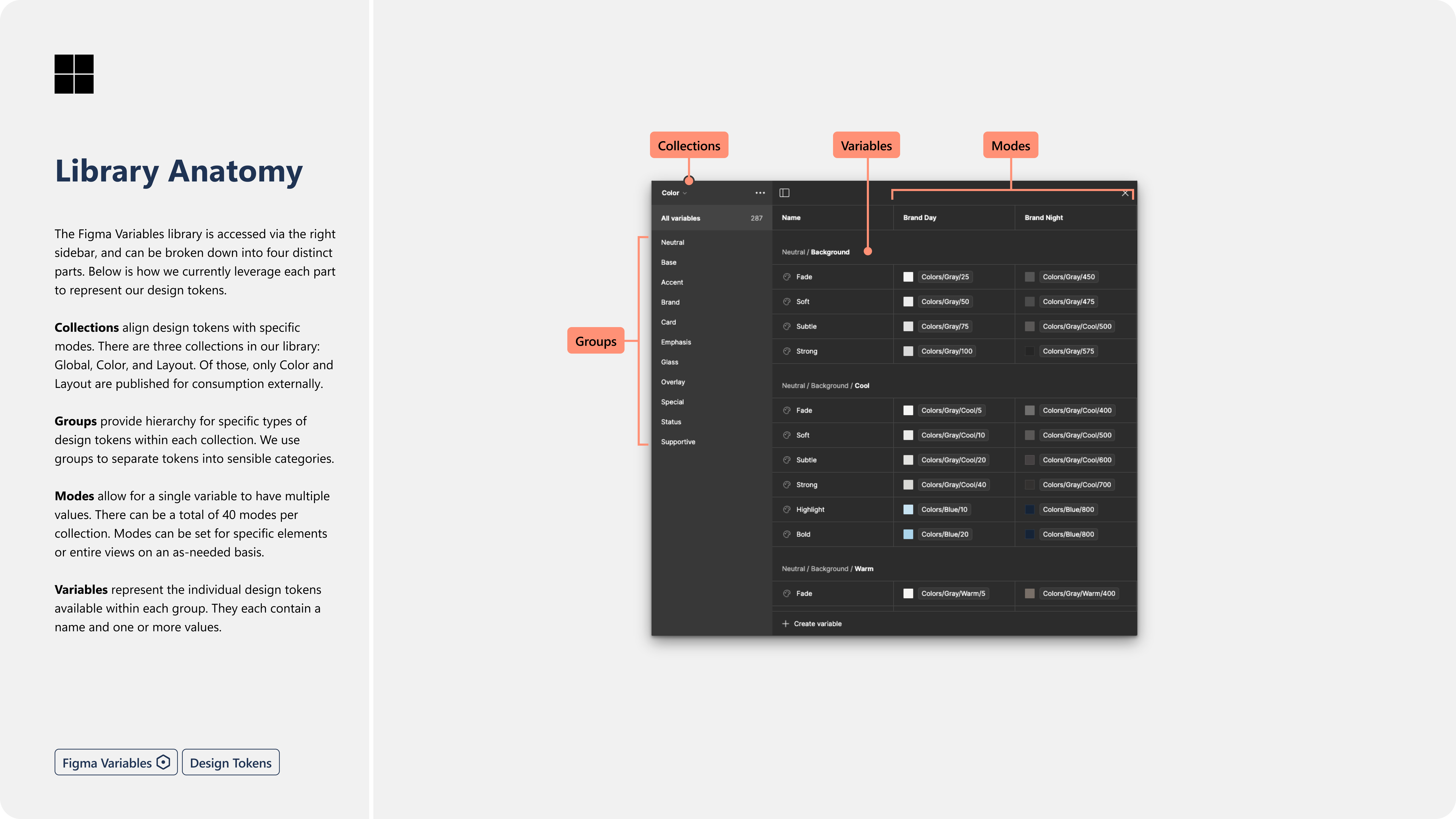
Design Tokens Top
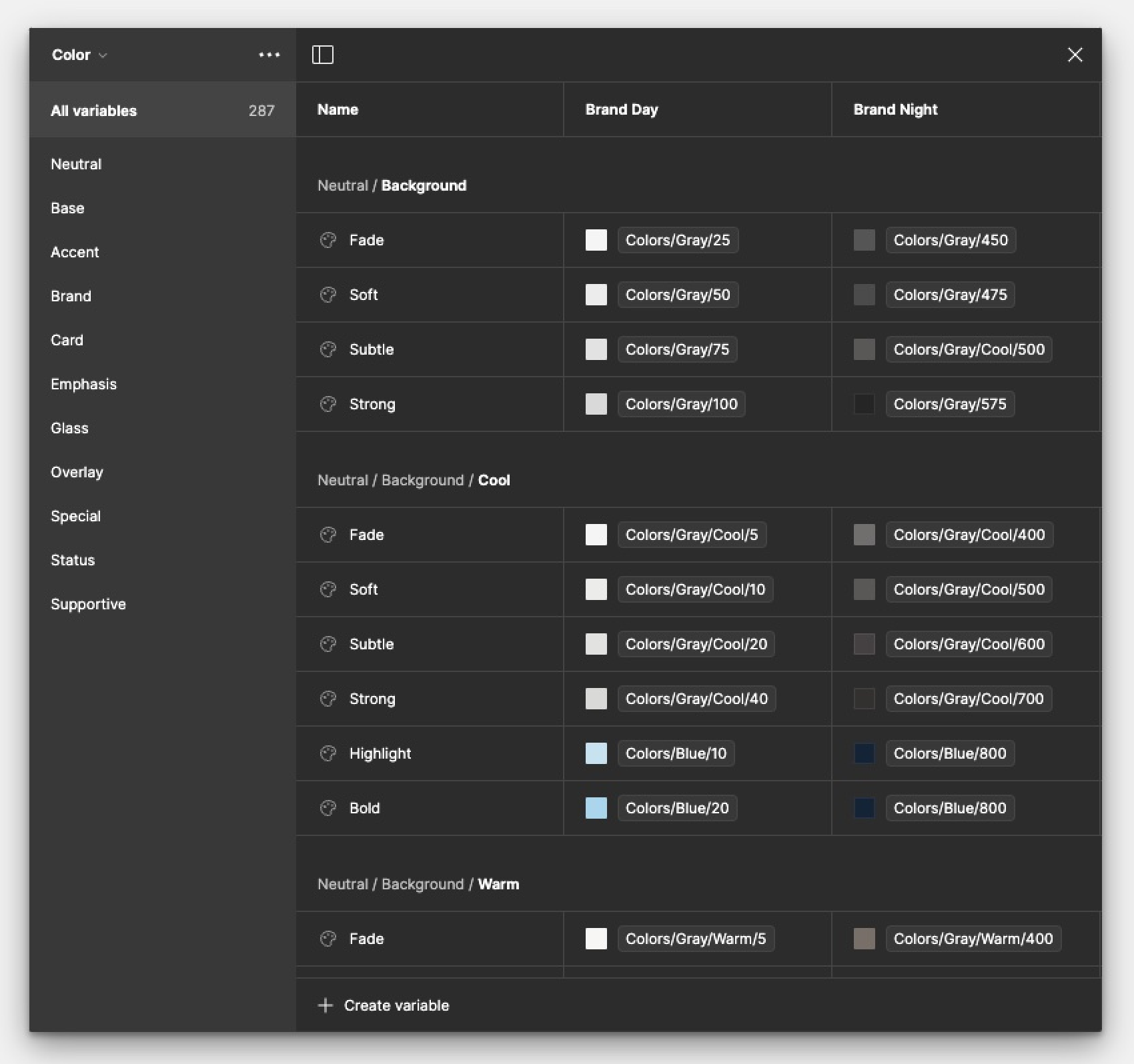
For Apollo, I structured our design tokens down to the semantic level to provide consumers with reusable, purpose-driven style primitives. This semantic tier offered a balance of usability and specificity, while significantly simplifying governance. Compared to managing hundreds or thousands of component-level tokens, a streamlined set of semantic tokens—organized by intent—proved far more sustainable over time.
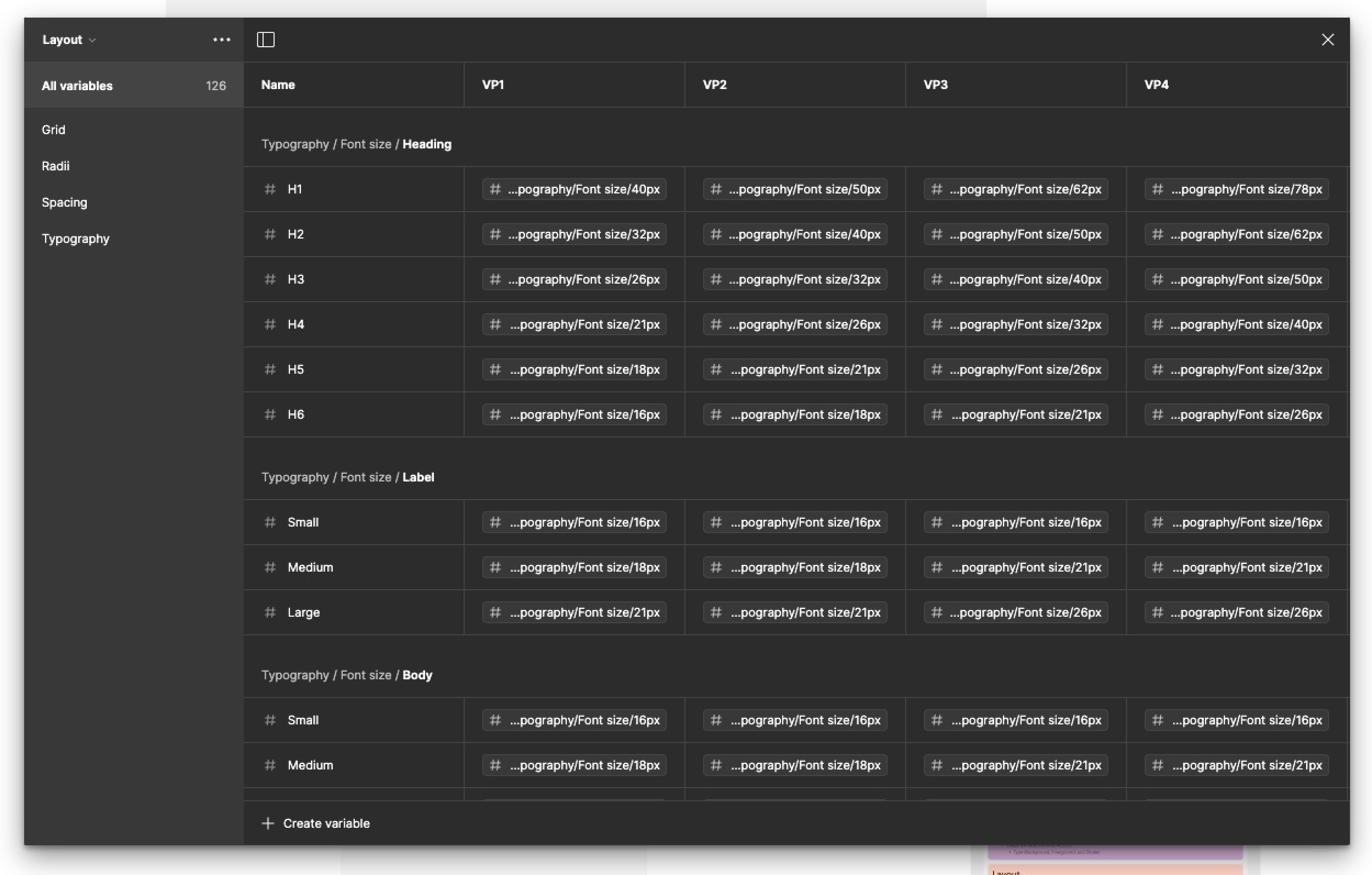
At Microsoft, I leveraged Figma's newly released typography variables to represent both base and semantic-level design tokens, enabling more flexible and scalable design solutions.
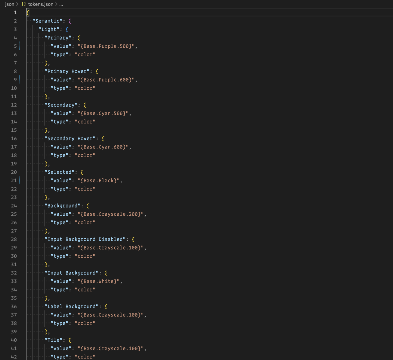
As a source of truth, I typically default to JSON, though I recognize that each system has unique needs. JSON is often the best choice because it is (mostly) human-readable, easily translates across different programming languages, and is accessible to both designers and developers. Additionally, as a web standard, it is more likely to outlast and scale better than any design software currently available.
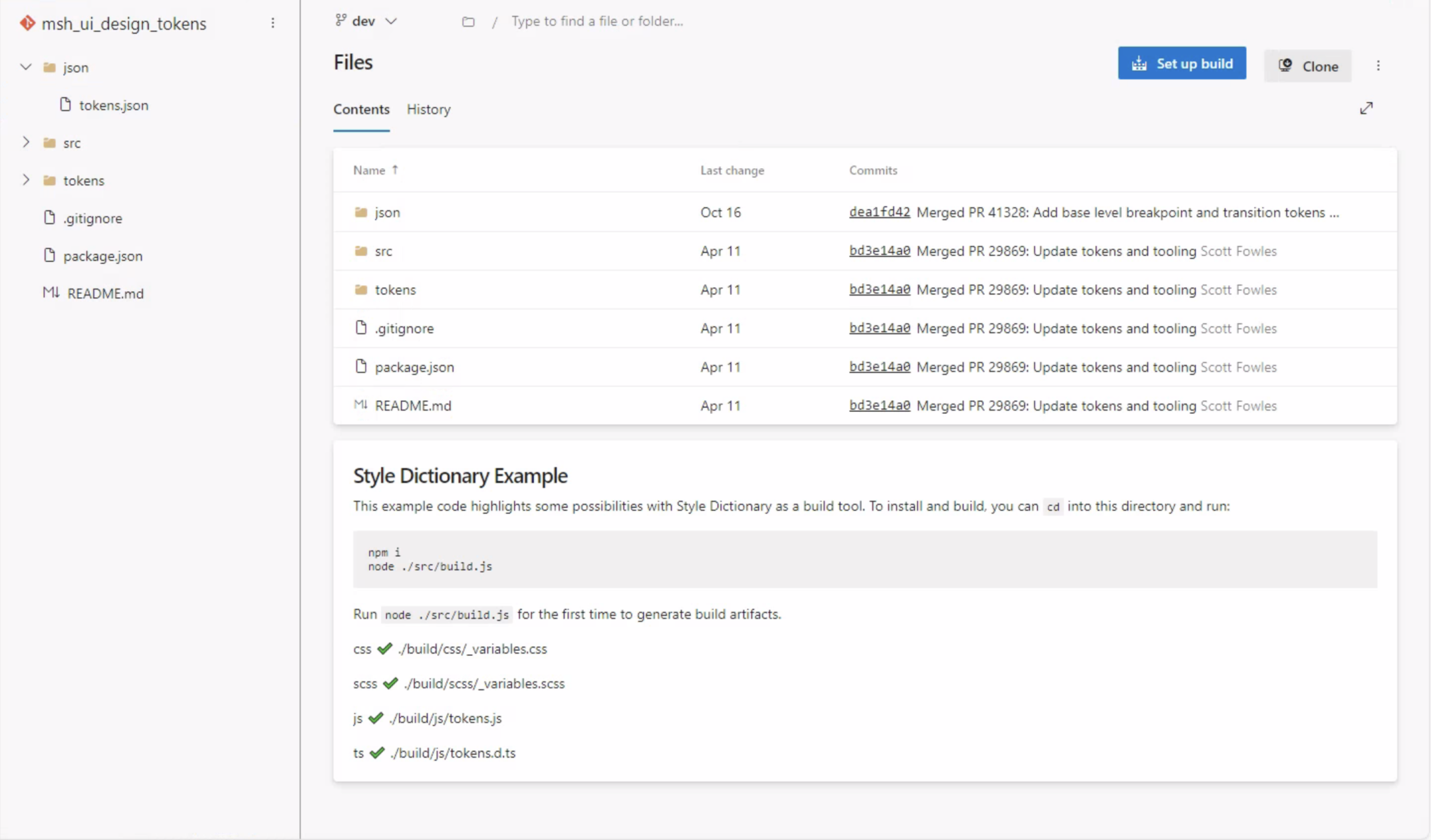
For Apollo, I implemented a build process using Amazon Style Dictionary to transpile design tokens from JSON into the formats used by the frontend development team, including CSS, SCSS, and JavaScript.
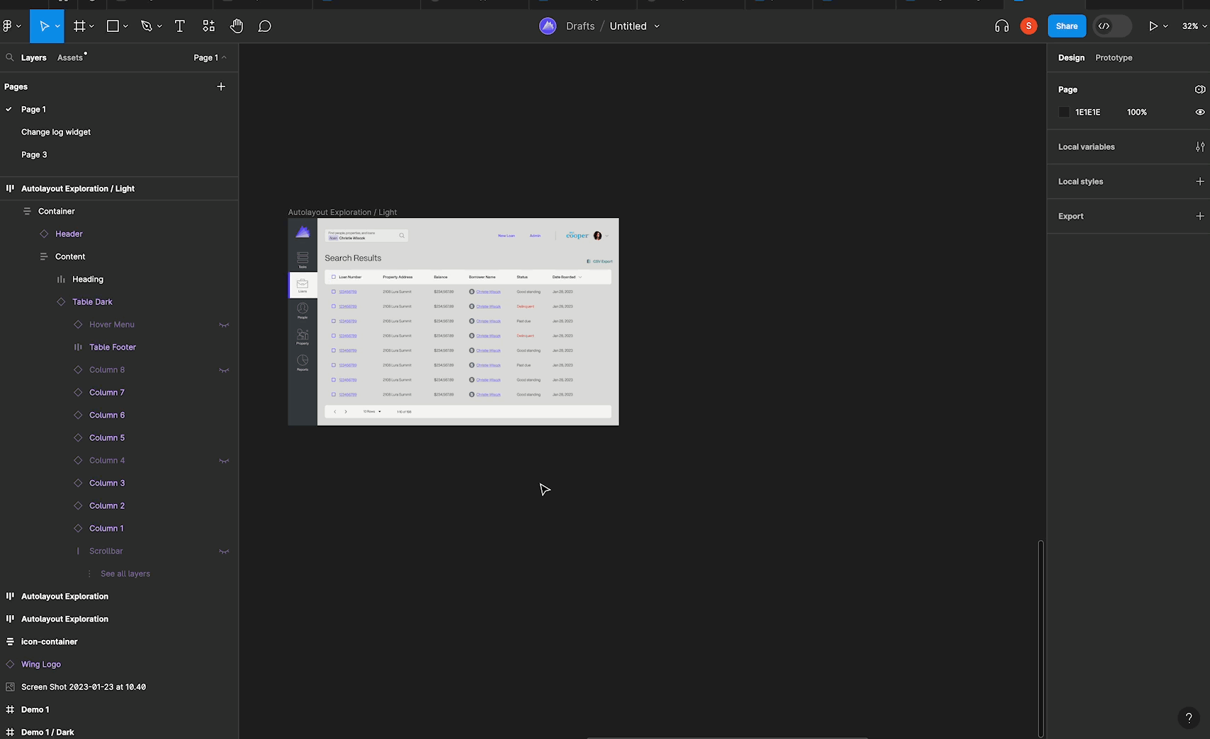
Components Top
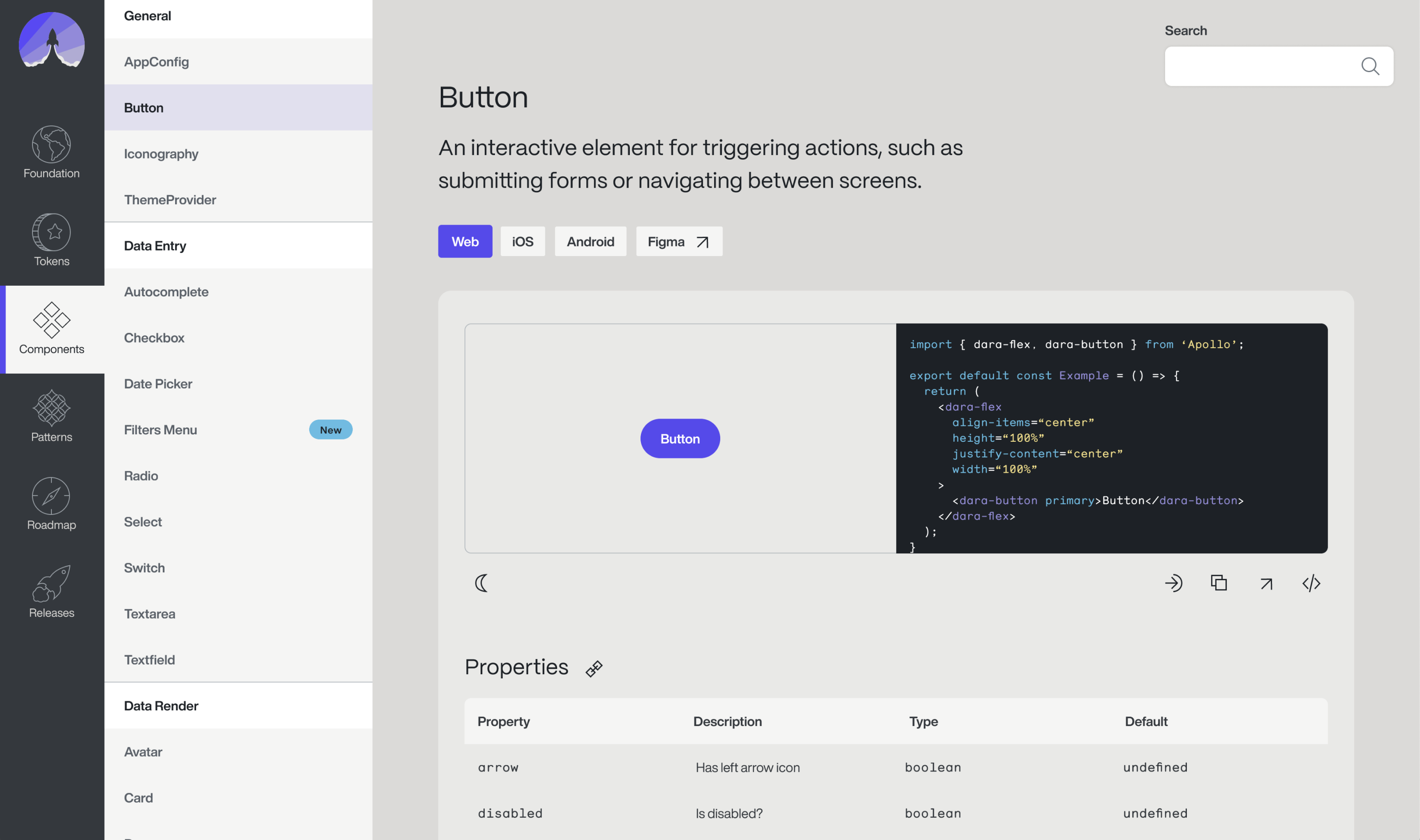
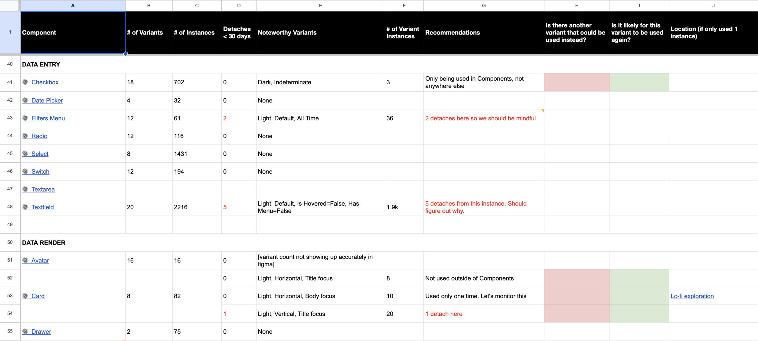
I designed a comprehensive catalog of components for Apollo to help designers maintain consistency and rapidly prototype their ideas. In many cases, components allowed designers to create high-fidelity prototypes just as quickly as low-fidelity ones, thanks to a robust component-based infrastructure. This approach often led to reduced communication overhead and minimized confusion during the handoff between design and development.
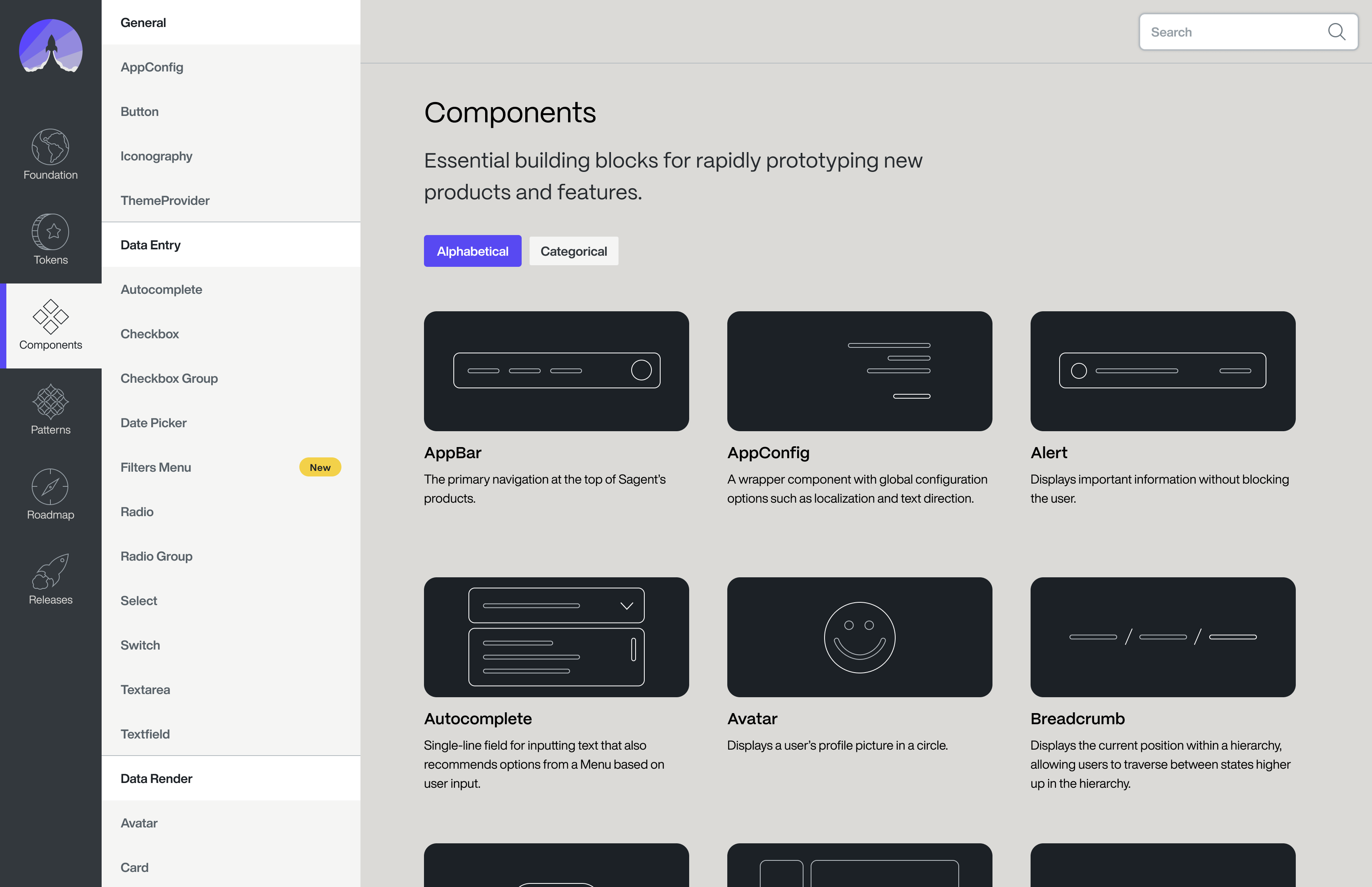
The Apollo library consisted of over 26 different components, used across every work stream of the flagship product. Components were categorized as
- General
- Data Entry
- Data Render
- Feedback
- Navigation
The result was a highly coherent and scalable design language throughout the product.
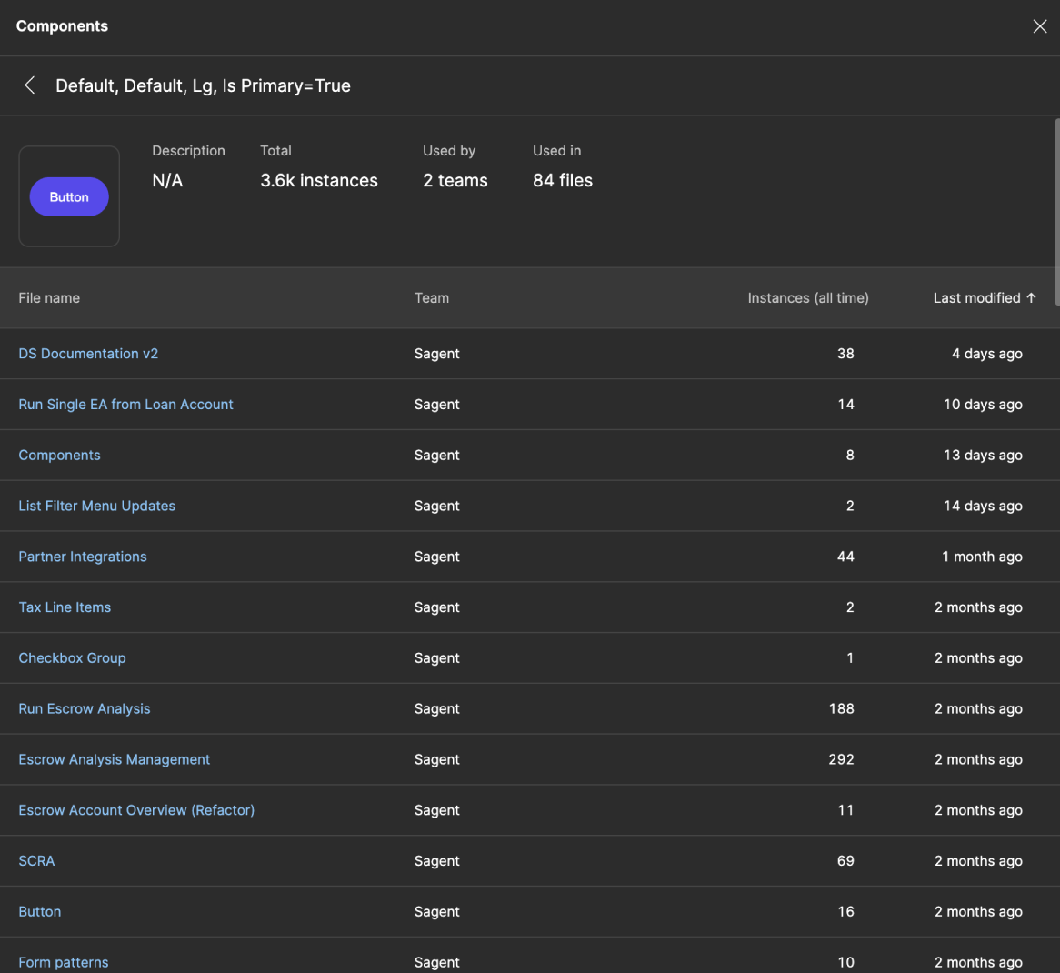
Building a component library is the easy part; the real challenge lies in maintaining and growing it over time. As design lead for Apollo, I drove adoption from zero to all five product workstreams by closely collaborating with product designers, engineers, and stakeholders. My approach focused on meeting consumers where they were and minimizing the effort required for adoption. For example, the Button component alone was instantiated over 3,600 times across 84 different files.
Patterns Top
Pattern is a nebulous term that is defined differently from system to system. My approach for taxonomy is to lean on definitions that provide the most meaning for the team and system's consumers.
At DreamHost in 2016, we used the terms "component" and "pattern" interchangeably, which worked for our team at the time. However, this approach eventually led to some confusion as the project evolved.
For Apollo, I defined "components" as UI elements of any size, while configurations of those elements designed to address specific user experience needs were referred to as "patterns."
At Microsoft, I collaborated with another system designer, and through workshopping with the broader team, we settled on defining "pattern" as any UI element that depended on smaller, individual elements. While this wasn't typically my first choice, it proved to be the most effective solution for our team and its specific needs.
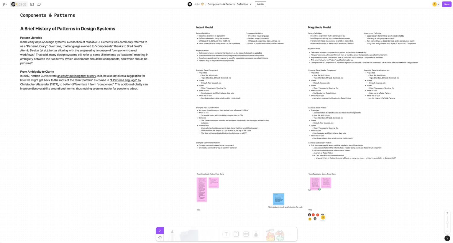
At PennyMac, we didn't use the term pattern in our system at all.
Although each of these systems defined the same terms differently, I consistently advocated for the definition that made the most sense to me at the time. At the same time, I fully supported whichever definition resonated most with the users of the system.
Measuring Adoption Top
I measure adoption by breaking down the concept of perfect adoption and modeling it across three dimensions: time, space, and anxiety. This framework allows me to derive meaningful signals and metrics to track adoption progress effectively.
Here's how I did that for the PennyMac Design System called Home.
| Goal | Signal | Metric |
| Intended usage occurred | Component inclusion, token inclusion, principle violations, style violations | Component inclusion rate, token inclusion rate, principle violation rate, style violation rate |
| Usage was effortless | Anxiety and stress, satisfaction | Designer NPS, designer satisfaction, engineer NPS, engineer satisfaction |
| Communication was effortless | Comms overhead, channel usage | Mean contact duration, contact rate, multi-contact rate, channel usage rates |
Turning Adoption Into Value Top
Transforming a design system from a cost center to a value driver can be modeled and tracked by evaluating key metrics such as operational cost, operational value, frequency, velocity, and time.
Cost refers to both human resources and tooling expenses. Frequency measures how often various components of the system are used, including actual components (e.g., Web or React Components), practices, processes, principles, and patterns. This is a key indicator of "adoption." Velocity tracks the time it takes for system consumers to accomplish tasks, providing insights into efficiency and productivity.
Savings is a measure of design costs, frequency, and velocity over time. This translates directly to operational value.
Scaling Past One Top
Advocacy Top
Advocacy often accounts for up to 50% of my role. At Microsoft, I collaborated with two design peers to lead communication and education efforts for our system. As part of this initiative, I created reference modules within Figma that offered designers quick, digestible tutorials on key system features—without requiring them to open new browser tabs. One example is a module I created to explain our implementation of design tokens using Figma Variables.
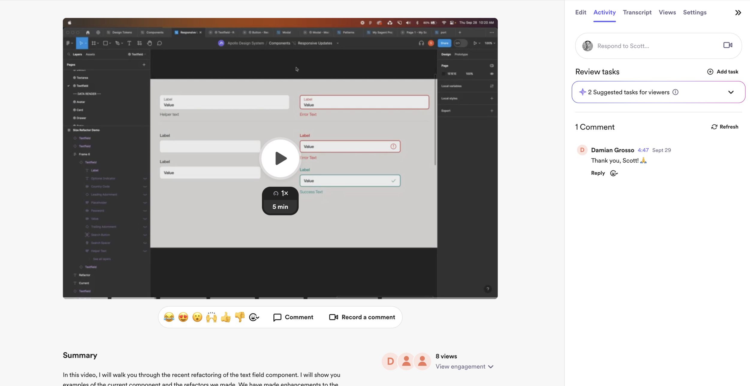
On Apollo, I implemented a recurring bi-weekly office hours session where designers, engineers, and product stakeholders could openly ask questions and provide feedback. Additionally, I created concise five-minute Loom videos to explain new features and updates to the system, making it easier for team members to stay informed.
The other side of advocacy comes in the form of governance. I view this as a necessary evil, and it's something that I have strong feelings about. I believe governance should be as automated as possible to eliminate bias. For the manual aspects, they should be flexible enough to allow consumers to explore both within and outside the system, while still maintaining its overall integrity.
Automation Top
I design and develop custom tooling to automate as much system maintenance and governance as possible. In addition to the Autopilot plugin, here are some example of other tools I've designed.
Scaffold
Scaffold is a Figma plugin that allows designers to input information into a simple form, which then automatically generates all the pages within a Figma working file based on the provided details. The outcome is a set of clean, consistent, and well-organized files that are easy to navigate.
Theme Magic
Theme Magic is a Figma plugin that enables designers to seamlessly translate designs between light and dark modes. By selecting one or more frames in Figma, designers can run the plugin with no additional input required, automatically generating a copy of the frame in the opposite theme. Theme Magic detects the theme of the original composition by analyzing the color tokens within the design.
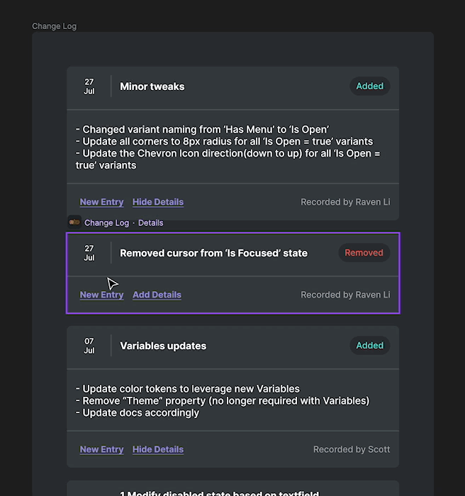
Change Log
The Change Log widget is a straightforward tool used by the Apollo design team to track changes at the component level. It automatically records the name of the contributor, making it a valuable resource for ensuring consumability and facilitating collaboration with stakeholders.