
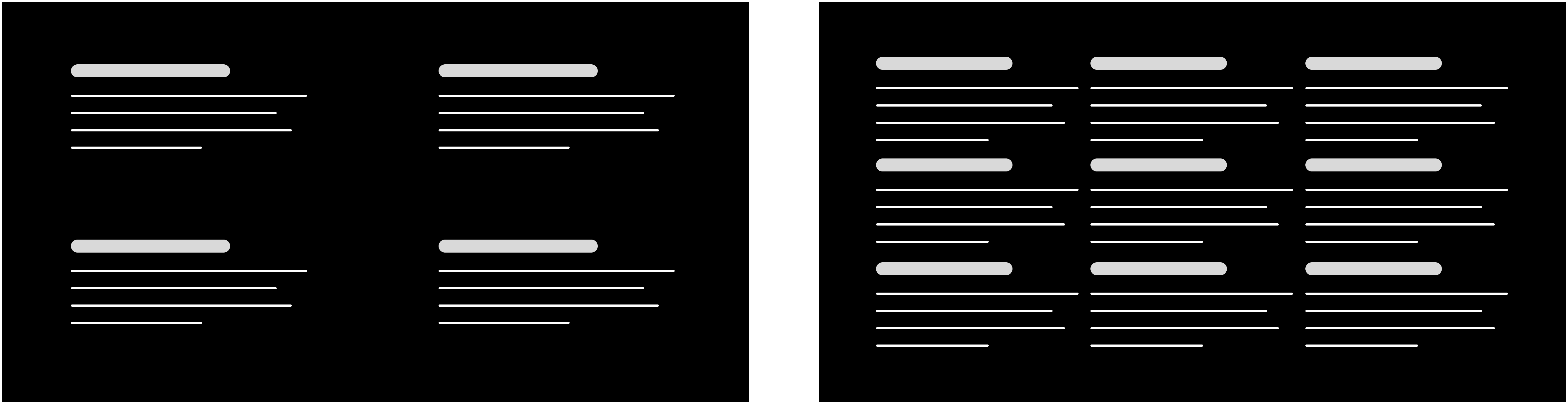
Somehow, somewhere, someone decided users want to see everything. Every dataset and every tab, splattered across their screens like an Excel-themed Jackson Pollock. And nowhere does this bizarre logic thrive more than in the haunted halls of enterprise software, where some well-meaning soul said, “If users are staring at the same data all day, let's just... give them all of it. All at once.”
Efficient? Not quite. What you actually get is a UI that feels like trying to read your life insurance fine print while being waterboarded. More data doesn't mean more clarity. It means more chaos. But here's the good news. It doesn't have to be this way.
Neuroscientists have been waving red flags about this for decades. Your brain's working memory isn't some bottomless pit of productivity, it’s more like a Post-it note that gets soggy under pressure (Cowan, legend, figured this out back in the '80s and again in the 2000's). There's even some evidence that your working memory can only juggle one lonely chunk of information before it taps out (cheers to Garavan, McElree, and Oberauer for that revelation).
So when you cram in more data, your brain slows to a crawl. You thought more options meant more control? Oh, bless. More options just means more mental potholes.
Then there's Hick's Law all the way back from 1952 which basically says the more choices you give someone, the longer they take to choose. It's not rocket surgery, it's basic human panic. You flood the senses, you freeze the brain.
That's why smart interface folks lean into things like progressive disclosure; essentially, don't dump everything on users in the first five seconds. Break things up, spread it out, spoon-feed information in digestible pieces. The result? Less cognitive overload, more “hey, this actually makes sense.”
The Space Within Top
In the world of UI design, space isn't just nice to have. It's a secret weapon. It works across two dimensions: within a view, and between views.
Inside a good interface, empty space isn't waste. It's strategy. It cuts through the noise without relying on a dozen borders, shadows, or whatever design trend is currently being abused.
Think of whitespace as a scalpel. It separates the useful from the fluff, giving your brain some much-needed breathing room. Flashy visuals have their place (like casino bathrooms), but when clarity is the goal, clean space is king.
The Space Between Top
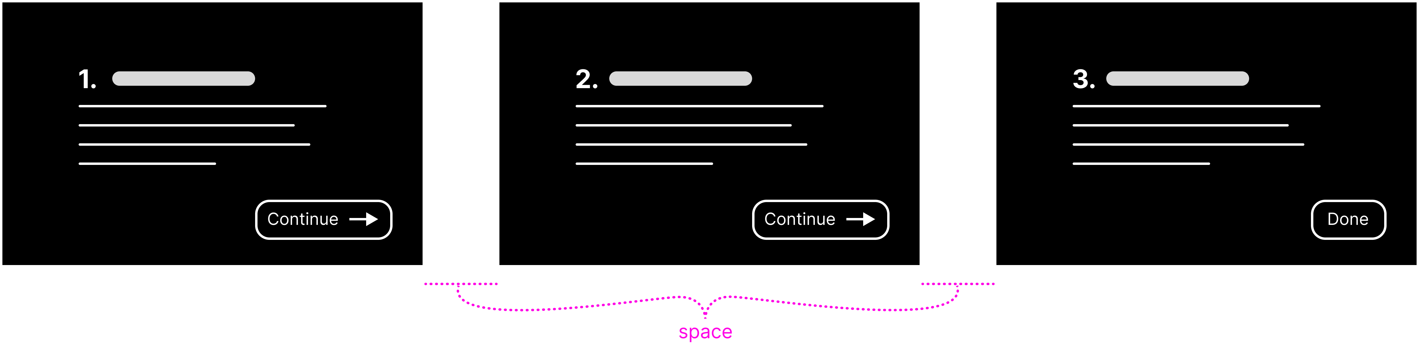
Moving between screens? That pause isn't dead air. It's a tactical breather. A reset button for your brain. Instead of chucking the entire buffet of data at users in one monstrous view, spread it across steps. Bite by bite, not firehose style.
Hyperlinks are a great example. Click, new view, one focus at a time. It's calm. Controlled. And in a world drowning in information, that moment of pause might be the only thing keeping your users from emotionally declaring war on their laptops.
Now, here's the trick. Spread things out too much, and you run into another problem. Users start working harder just to dig out the info they need. Every extra click becomes a little slap on the wrist. Hide things too deep, and you've simply traded cognitive overload for physical frustration. Congratulations, your app now feels like a treasure hunt through molasses.
The Space-time Continuum Top
Here's a weird truth: in both physics and human cognition, density affects time.
Big, complex screens can actually feel slower. Just like how gravity stretches time around massive celestial bodies, giant data dumps slow down the brain. It's not that people are lazy. It's that cognitive overload makes processing crawl. You flood the brain, and it responds by tapping the brakes.
Focus on showing the right data, and you'll cut through the cognitive noise like a hot knife through butter. It's not about giving the user more to chew on, it's about giving them less to wade through. Cleanly chunked content across well-paced views makes even massive data sets feel light and navigable. Like skating on ice instead of wading through syrup. Less effort, more clarity.
And now, we're on the edge of something new: generative UI. These aren't your grandma's static dashboards. We're talking about systems that adapt on the fly. Large language models that act like digital concierges, tailoring content in real-time based on what users need in the moment.
The right data, for the right person, at the right time—without digging.
That's the future. And if it delivers, we might finally leave behind the era of overwhelming dashboards, panic-inducing spreadsheets, and desperate attempts to make sense of it all. A little less chaos, a lot more clarity, and maybe, just maybe, we can stop fantasizing about throwing our laptops in a river.